I learned the hard way that white cabinets aren’t just pretty—they’re strategic. They bounce light around like tiny mirrors, making your small kitchen feel more spacious. Pair them with brown worktops, and your kitchen feels grounded and deliberate instead of sterile. Satin finishes handle ketchup splatter without showing fingerprints. Warm whites (not that dentist-office glare) shift with your natural light. The result? A kitchen that feels larger without renovation costs—and there’s much more about maximizing this effect.
White Reflects Light and Makes Small Kitchens Feel Larger
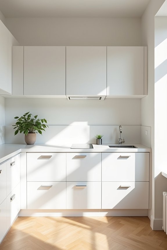
Light—that sneaky accomplice to good design—does more durable work in a cramped kitchen than most of us realize. I’ve learned this the hard way: my galley kitchen felt like a cave until I embraced white cabinetry and lighter countertops. White reflects both natural and artificial light, bouncing it around like a pinball machine—suddenly, my cramped space didn’t feel suffocating. White walls and cabinetry minimize shadows, making the room feel open rather than like a poorly lit interrogation chamber. Pair white with light quartz or pale countertops, and you’ve created visual continuity that tricks your eye into perceiving more square footage than actually exists. It’s not magic; it’s physics meeting design. The result? A kitchen that finally functions better.
How White Cabinets Bounce Light
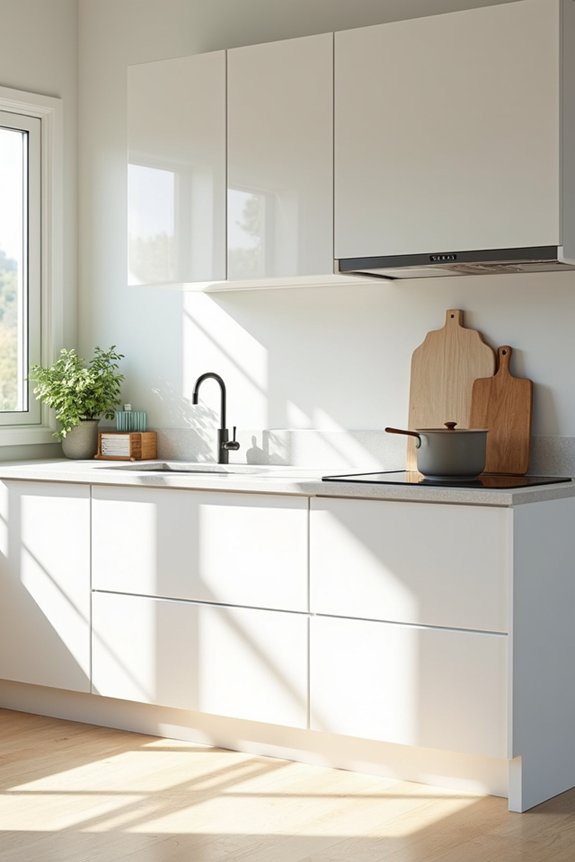
I’ve learned the hard way that white cabinets aren’t just sitting there looking pristine—they’re basically tiny mirrors working overtime, bouncing every ray of natural light around your kitchen like it’s some kind of luminous pinball machine, which means you’re not stuck squinting at your countertops like you’re deciphering ancient hieroglyphics. What used to feel like a cramped shoebox (complete with that lingering Chuck E. Cheese cup smell from last month) suddenly reads as spacious, thanks to how glossy finishes amplify brightness and create this visual expansiveness that makes you forget you can practically high-five someone from across the room. My designer friend calls it “reflective multiplication”—a fancy way of saying that white cabinets turn modest natural light into an architectural illusion, stretching the perceived depth of your space without requiring you to actually renovate or, heaven forbid, move houses.
Reflective Surfaces Maximize Brightness
How’s this for a kitchen reality check: I once stood in my friend’s white-cabinet kitchen at noon and couldn’t tell if she’d paid her electric bill, because the space was practically glowing without a single light on.
That’s what reflective surfaces do. White cabinets don’t just sit there looking clean—they’re basically tiny mirrors bouncing natural daylight everywhere. Pair them with light countertops and backsplashes, and you’ve created a luminous environment where shadows practically disappear. Gloss or semigloss finishes amplify this effect even more, turning ordinary midday sun into what feels like professional studio lighting.
You get even luminance across your entire kitchen, minimal visual weight, and zero artificial light needed until dinner prep. My dark-cabinet kitchen? Still waiting for that result.
Natural Light Amplification Effects
Ever notice how white cabinets seem to have their own internal light source, even when you’re standing in what should technically be a dim corner? I’m convinced they’re basically tiny light factories.
Here’s what’s actually happening:
- White surfaces bounce daylight throughout your kitchen instead of absorbing it like my dark cabinets used to
- Reflected light reduces shadows, making cramped spaces feel genuinely bigger
- Natural illumination amplifies across the room, eliminating those depressing cave-like corners
- You’ll actually see what you’re cooking—practical stuff, honestly
My designer friend calls it “strategic luminosity.” I call it finally understanding why my mom insisted white was “timeless.” She wasn’t being annoying; she was basically installing free lighting. Those white cabinets? They’re working harder than I ever did, bouncing sunshine everywhere like some kind of obsessed ping-pong ball.
Visual Space Expansion Through Luminosity
When’s the last time you actually noticed how light moves through your kitchen? I didn’t either—until I realized my cramped galley looked like a cave. White color bounces light around like it’s playing pinball, expanding perceived space without knocking down walls. Those reflective surfaces? They’re basically free square footage. My designer friend calls it “luminosity magic,” which sounds pretentious, but she’s right. White cabinets brighten shadowed corners into visible zones. Suddenly, that corner where mystery stains live doesn’t feel like a dungeon anymore. Your small kitchen won’t magically become spacious—let’s be real—but it’ll feel less like you’re cooking inside a Chuck E. Cheese ball pit. The white color palette genuinely tricks your brain into thinking you’ve got breathing room.
Why White Works as Your Foundation
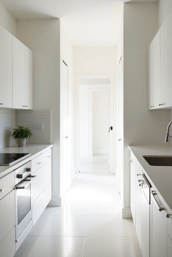
I learned the hard way that white isn’t boring—it’s basically the Switzerland of kitchen colors, staying neutral while I pile on whatever mood I want (wood shelves one month, brass hardware the next). Think of it as your visual blank slate: white soaks up natural light like I absorb coffee, creates this oddly calming effect that makes even my Chuck E. Cheese cup collection look deliberate, and somehow never goes out of style—unlike my decision to paint my last kitchen avocado green. Designers call it a “lasting foundation,” which is designer-speak for “you won’t regret this in five years,” and honestly, after watching my mom repaint her kitchen three times before I turned twelve, I’m here for it.
Calm Visual Foundation
White’s the foundation that actually works—unlike my attempt to keep a cream-colored couch pristine around two kids and their inexplicable ability to find ketchup in every crevice.
Here’s why white cabinetry creates that calm visual foundation we’re all craving:
- Neutral backdrop for contrasting countertops, backsplashes, and accessories
- Reduces shadows and creates cleanliness without fuss
- Serves as a psychological reset button after chaotic mornings
- Allows your personality to come through styling choices
White doesn’t demand attention—it just sits there, composed, like that one friend who never raises their voice. Your kitchen becomes a blank canvas instead of visual chaos. I’m envious of people who achieve this without strain. When everything else screams—sticky fingerprints, forgotten Chuck E. Cheese cups, dinner prep disasters—white absorbs the noise gracefully, creating space to breathe.
Natural Light Enhancement
It bounces natural light around like it’s got a personal investment in your happiness, making those cramped 8×10 spaces feel almost—*almost*—like actual rooms instead of efficient closets. I’ve watched white walls change my kitchen from a shadowy cave where I’d lost three spatulas to something that actually breathes. The reflective surfaces work overtime, stretching light from that single window across every surface, reducing those harsh shadows that make everything feel smaller. Your natural light isn’t just visiting anymore—it’s *working* for you, expanding perceived space without requiring actual square footage. Designer Sarah Chen calls this “visual multiplication,” which basically means white’s the trusty friend who makes your tiny kitchen feel less like a punishment and more like an intentional choice.
Timeless Design Choice
you’re not actually limiting yourself, you’re just refusing to apologize for it. White becomes your design foundation—the reliable friend who doesn’t judge your Chuck E. Cheese cup collection. I’ve discovered that white cabinetry paired with brown countertops creates freshness while keeping things warm and inviting.
Here’s why white actually works:
- It supports versatile styling, from Scandi to farmhouse
- It serves as a neutral backdrop for color pops
- It simplifies maintenance across multiple properties
- It integrates clean, cohesive visuals without clutter
You’re not being boring; you’re being strategic. White’s longevity means you’re building something that’ll outlast trends—and honestly, your patience with ketchup stains on everything else.
Warm White vs. Stark White: Which Suits Small Kitchens?
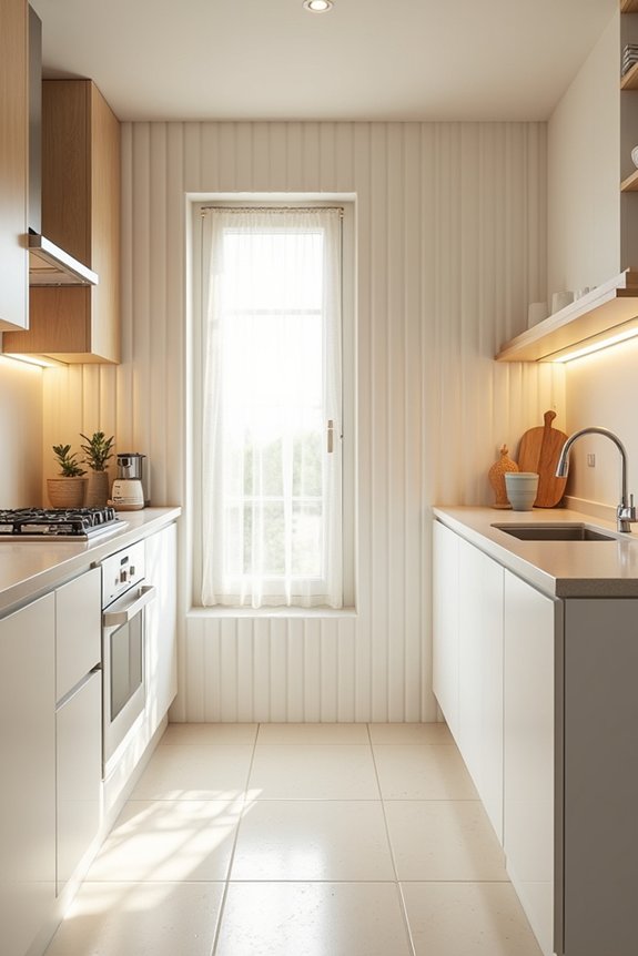
When’s the last time you walked into a kitchen painted stark white and thought, “Ah, yes, this feels like home”—rather than, say, a dentist’s office mid-root canal?
Yeah, me neither.
That’s where warm whites come in. Unlike their sterile cousins, warm whites like Simply White create that inviting atmosphere you want to cook in. They shift beautifully with your lighting, preventing that dingy look dim kitchens struggle with. Better yet, they pair smoothly with wood accents and metallics—no cold, clinical vibes.
Think of it this way: stark white screams institutional; warm whites whisper “gather here.” One color across all surfaces? You’ve got unified, low-maintenance design. Your future self—and your landlord—will appreciate your choice of warmth over sterility.
Why Brown Worktops Pop Against White Cabinets
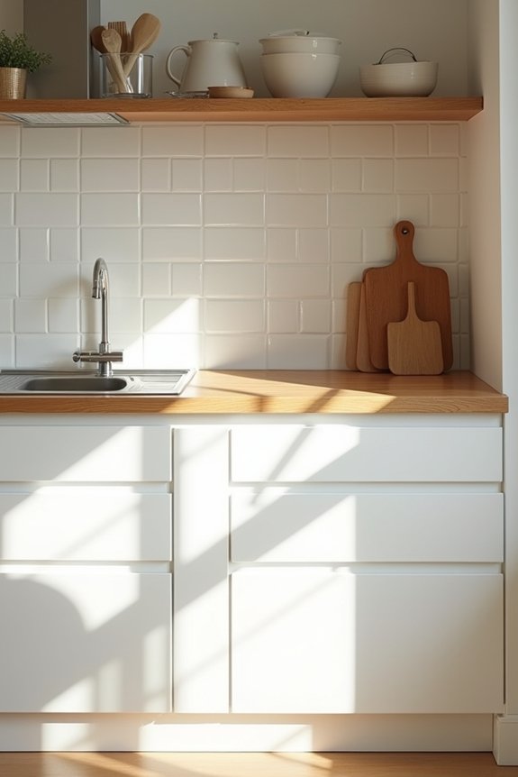
I learned the hard way that white cabinets alone feel sterile—like living inside a hospital waiting room—until I introduced brown worktops, which suddenly made my kitchen feel less bare. The contrast isn’t just visually dramatic; it’s the warmth my white walls needed, and honestly, it’s the only design choice my parents have ever agreed on without invoking their usual contradictions about practicality versus aesthetics. Brown countertops do the work here, grounding those bright whites while keeping the space from feeling overwhelming—it’s a visual balance that actually works in real life, ketchup stains and all.
Contrast Creates Visual Drama
- Brown grounds the brightness white reflects, preventing that sterile, hospital-fluorescent vibe
- The contrast creates visual anchors, making each zone feel deliberately designed
- Depth emerges where flatness once reigned, adding sophistication without clutter
- Your eye actually *stops* somewhere instead of bouncing frantically around
That warmth against cool white? It’s not just pretty—it’s strategic. Designers call it “visual tension,” but honestly, it just works.
Warmth Balances Bright Whites
Picture this: you’ve gone all-in on white cabinetry because you’ve read every article promising an airy, light-filled kitchen, and then you realize you’ve accidentally created something that looks like a dentist’s office had a baby with a laboratory.
Enter brown worktops—your kitchen’s emotional support counter.
I discovered this the hard way. My white cabinets were reflecting every fingerprint, every dust mote, every sticky residue from my kids’ juice boxes. Then I added brown counters, and suddenly? The space felt lived-in. The dark wood grounds the brightness, keeping white surfaces from looking clinical and sterile. Brown absorbs light where white bounces it back relentlessly, creating this balance that actually feels like home—not a showroom nobody’s allowed to touch.
White Cabinetry Reduces Visual Clutter
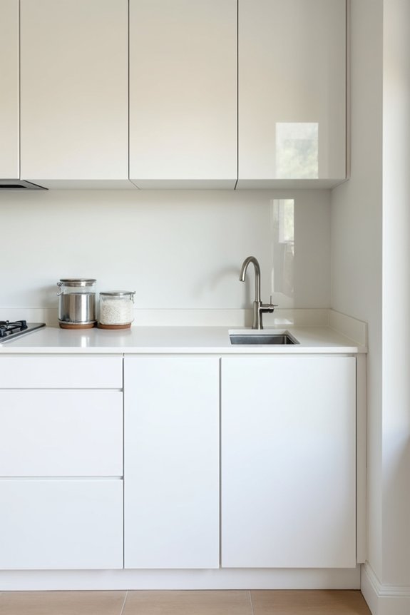
Why does a small kitchen packed with colorful cabinets feel like you’re living inside a cereal aisle?
White cabinetry cuts through that chaos. I learned this the hard way after my kitchen looked like a craft store exploded. Here’s what white does:
White cabinetry cuts through visual chaos, transforming a cramped kitchen from craft-store explosion into serene, intentional space.
- Eliminates visual noise that makes tight spaces feel suffocating
- Creates sight lines that stretch the room psychologically
- Lets your countertops and appliances breathe without competing colors
- Makes organization actually visible instead of hidden behind a rainbow
Designer Sarah Barnard says, “White cabinets are visual silence.” That’s exactly what my kitchen needed—less screaming, more serenity.
When everything’s white, you’re not distracted by cabinet drama. Your eyes travel smoothly across surfaces. Suddenly, that cramped 80-square-foot kitchen doesn’t feel like a closet anymore. It feels deliberate. Clean. Yours.
Easy-Clean White Finishes
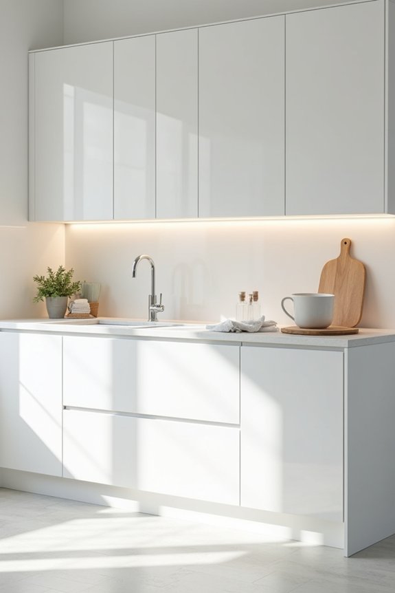
So there I was, staring at a fingerprint smudge on my cabinet that looked like it’d been there since the Obama administration. Turns out, choosing the right white paint color matters—a lot. Satin and eggshell sheens? They’re my go-to tools. They wipe clean without broadcasting every sticky toddler handprint like a crime scene.
| Finish Type | Cleaning Ease |
|---|---|
| Flat | Difficult to clean |
| Eggshell | Very easy |
| Satin | My preference |
| High-gloss | Shows fingerprints easily |
| Matte | Hides marks well |
Flat finishes hide imperfections beautifully—until you need to actually clean them. That’s when I learned something practical: balance matters. White cabinetry with satin sheens lets me tackle ketchup explosions and mysterious Chuck E. Cheese cup residue without losing my mind.
Best Accent Colors for White Cabinets and Brown Worktops
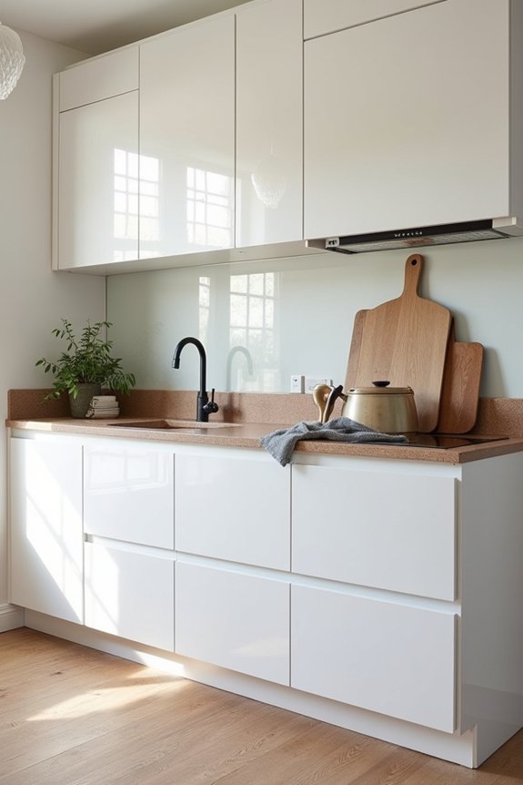
- Light blue or gray backsplashes add dimension without feeling sterile
- Simply White paint shifts with natural light, preventing a cold, uninviting vibe
- Black or dark gray countertops create dramatic contrast while keeping things open
- Wood accents—open shelving, a dining table—soften the scheme and prevent design monotony
Wood tones warm brown worktops well, while subtle color accents prevent your kitchen from feeling like a blank canvas. You’re not just decorating; you’re creating a space that functions properly and handles fingerprints better than white-on-white schemes ever could.
Small Kitchen Layouts That Showcase White and Brown
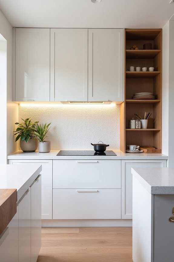
Once you’ve nailed down your accent colors, the real magic happens when you actually arrange your kitchen—and I’m not talking about playing Tetris with your appliances at 11 PM.
The real kitchen magic happens when you actually arrange your space—not playing Tetris with appliances at midnight.
I’ve learned that U-shaped layouts with white cabinetry work well in cramped spaces. Pair those clean white cabinets with brown worktops, and your small kitchen starts to feel more deliberate rather than claustrophobic. Open-concept designs work too—they’re basically permission to pretend your kitchen *isn’t* where mystery stains appear.
Light wood floors amplify this effect, bouncing natural light around like you’re living in a well-designed space rather than a shoebox apartment. Minimal hardware keeps things uncluttered—no dangling knobs catching your sweater while you’re frantically wiping up spilled orange juice.
The white and brown combination delivers both cleanliness and natural warmth simultaneously, which is basically the kitchen equivalent of having your Chuck E. Cheese cup and drinking from it too.
Timeless White and Brown Palettes
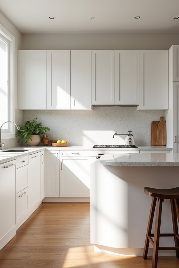
Why do white and brown kitchens never seem to go out of style, while every other trend I’ve committed to—avocado appliances, anyone?—ages about as well as last season’s fashion? I’ve realized the appeal isn’t mystery; it’s permanence built in.
Here’s what makes this pairing endure:
- White cabinets reflect light, keeping spaces feeling fresh and open
- Brown countertops ground the palette with warmth and authenticity
- Wood accents introduce texture without visual chaos
- Metallic details prevent the combo from feeling sterile or dated
This isn’t some social media aesthetic destined for oblivion. It’s the design equivalent of jeans and a white t-shirt—reliable, adaptable, forgiving of sticky fingerprints and Chuck E. Cheese cup rings. That’s longevity right there.