The space above your kitchen cabinets isn’t just a dust magnet—it’s your chance to flex. I’ve learned the hard way: bold swing-arm sconces draw the eye upward (designer Tiffany Brooks calls it “theatrical”), while layered woven baskets hide the overflow that’d otherwise scream chaos.
Odd-number groupings of vintage finds, mirrors reflecting light, continuous backsplash lines, or a single strong art piece brings intentionality to that dead zone. The trick? Restraint beats cramming. There’s a whole playbook ahead.
Light Up Above Kitchen Cabinets With Statement Fixtures
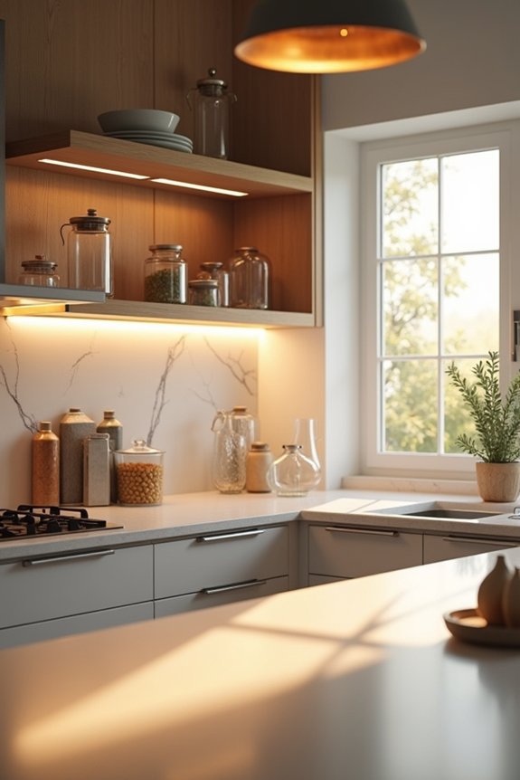
Why do we spend months agonizing over cabinet hardware but then leave the space above our cabinets looking like a forgotten storage unit? I’m guilty—my cabinet-top display featured dusty serving platters and a lonely Chuck E. Cheese cup. Then I discovered that statement lighting changes how a kitchen feels.
Oversized swing-arm sconces flanking your range create drama that actually draws eyes upward instead of toward last night’s dishes. I’m talking bold fixtures that pop against your walls, not timid little bulbs hiding in corners. Designer Tiffany Brooks nails this approach: lighting should be deliberate, theatrical even.
Your overhead gaps aren’t wasted real estate—they’re prime canvas. When you choose sconces that complement your cabinetry’s lines and color, suddenly that forgotten corner becomes part of your deliberate design. That’s the moment when your kitchen stops apologizing for itself.
Layer Woven Baskets for Texture and Storage
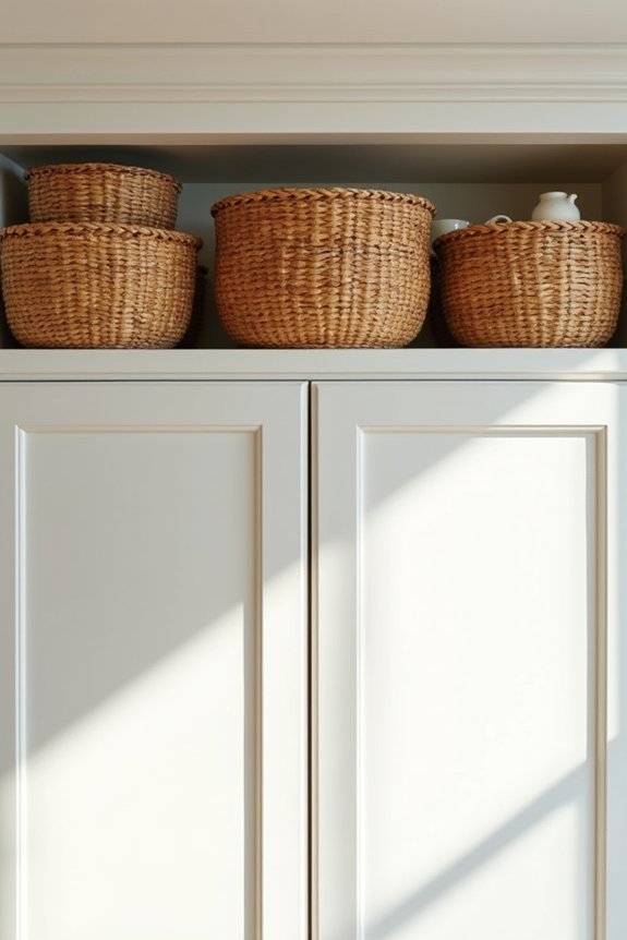
I discovered that layering woven baskets above my cabinets filled that awkward gap with purpose—whitewashed baskets catch light nicely, while hidden inside are all the things I’d rather not acknowledge (expired food storage containers, anyone?). Varying the shapes and sizes prevents everything from looking like a sterile, uniform display, and placing some on their sides creates little nested vignettes instead of broadcasting “I have too much stuff,” which—let’s be honest—is basically what parenting looks like. The key is coordinating basket tones with your wall and cabinet colors, because nothing derails the whole look faster than throwing in some neon wicker that screams craft fair disaster. Adding odd-numbered groupings with plants or vases gives it a gallery-like quality that conveniently distracts guests from the Chuck E. Cheese cups hiding behind them.
Texture and Visual Warmth
What baskets actually do for your kitchen:
- They catch light differently than solid surfaces, creating visual depth
- Whitewashed finishes bridge your cabinet and wall colors without friction
- Varied shapes prevent that sterile, showroom vibe
- Dark-toned baskets ground the space without demanding attention
My kitchen went from “corporate break room” to “actual human lives here” once I swapped clinical shelving for woven layers. Those above-cabinet zones stopped feeling like forgotten storage and started looking deliberate.
Concealing Storage With Style
Baskets above your cabinets aren’t just pretty—they’re the visual equivalent of that friend who somehow makes chaos look intentional. I’ve learned that woven baskets turn kitchen cabinets into legitimate storage, not just decorative real estate. Stack them in varied heights—it breaks up monotony and prevents that “sad shelf” vibe. Choose inky, moody textures that contrast light cabinetry, or match them to your walls for cohesion. Here’s the kicker: baskets hide overflow brilliantly. Shove Christmas napkins, weird serving pieces, and those Chuck E. Cheese cups nobody wants visible. Secure them properly though—safety matters, especially if earthquakes visit your kitchen. The result? Storage that looks deliberate rather than desperate. Your cabinets shift from “where’d that come from?” to genuinely stylish.
Color Coordination and Balance
Why do we torture ourselves pretending that a random assortment of baskets looks intentional when it actually looks like we raided a HomeGoods clearance bin?
I’ve been there—mismatched woven chaos staring down at me like judgment. Here’s what actually works in the space above your cabinets:
- Match basket tones to wall or cabinet colors (grays, blacks, wood)
- Vary shapes and sizes deliberately—tall, wide, shallow—for intentional rhythm
- Layer whitewashed finishes to brighten and soften moody backdrops
- Pair baskets with light storage items like vases to balance visual weight
The key is coordination. When I stopped fighting my cabinet’s charcoal tone and embraced it with matching baskets, suddenly everything felt designed rather than desperate. That’s the difference between “oops” and “on purpose.”
Showcase Vintage Collections With Odd-Number Groupings
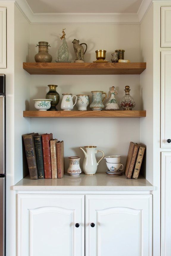
I learned the hard way that grouping my vintage finds in threes and fives—not the chaotic pile-of-everything approach I’d inherited from my mom’s “organized chaos” era—actually makes them look deliberate rather than like I raided an estate sale and gave up halfway through unpacking. Mixing scales and colors strategically, pairing that amber bottle collection with a weathered wooden spoon and some trailing greenery, creates the kind of carefully arranged-but-casual vibe that makes people assume I have my life together, which, spoiler alert, I don’t. The real trick is resisting the urge to cram every vintage pitcher and crock up there; restraint—something my impulse-buying brain fights constantly—turns your kitchen into a designed space instead of a dusty museum exhibit.
Odd Numbers Create Visual Interest
When you’ve got a collection of vintage crocks staring down at you from above the cabinets, the thing is—arrange them in threes or fives, not pairs. Odd numbers just work. Here’s why:
- Pairs feel static, like salt and pepper shakers at a sad diner
- Odd groupings create natural rhythm and keep your eye moving
- Three amber bottles beat two every single time
- Five items in varied heights prevent that “museum shelf” flatness
I learned this the hard way after my lopsided attempt with matching ironstone bowls—looked like I’d given up mid-decorating. Designer Carl Dellatore notes that odd numbers “inherently suggest intentionality.” When you’re going for that curated, relaxed look—the aesthetic that reads as deliberate and considered—odd numbers deliver the goods.
Layering Vintage Pieces Strategically
I learned this the hard way—cramming crocks above cabinets like I was prepping for a yard sale. The breakthrough came when I centered a substantial pottery crock, flanked it with amber bottles and a wooden utensil, then stepped back. Suddenly, that chaotic jumble became something deliberate. Balance matters. Your eye needs that heavy anchor piece, those complementary supporting players, and honestly? A trailing vine doesn’t hurt either.
Color And Scale Balance
I’ve learned that odd numbers create visual rhythm—they’re somehow less chaotic than their even counterparts. When I finally ditched the symmetrical approach my mom swore by, everything clicked. Here’s what actually works:
- Group tall pieces centrally, flanking with shorter candle holders and cookbooks
- Paint your cabinet gap a bold, contrasting color—it makes everything pop
- Mix amber bottles, ironstone, and milk glass for cohesive historic warmth
- Tuck greenery between pieces to soften that “grandmother’s shrine” vibe
Balance isn’t about perfection; it’s about creating rhythm. My designer friend calls it “controlled chaos,” which basically means you’re allowed to stop obsessing. Three items have breathing room. Five items work well together. Four items? They just sit there, judging you silently.
Add Built-In Trim or Wainscoting for Elevated Finishes
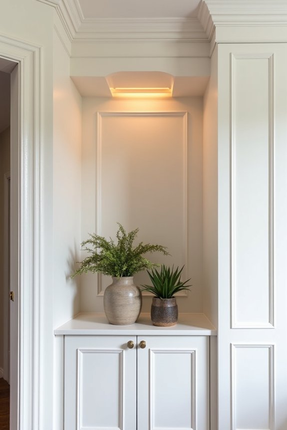
If you’ve ever stared at that dead zone above your cabinets—that awkward, dust-collecting gap between the cupboard tops and ceiling—you’re staring at what interior designers call “wasted opportunity” and what I call “the visual equivalent of leaving your fly down at a dinner party.” Installing architectural woodwork like wainscoting fills that void and shifts your kitchen from “nice enough” to “did a professional live here?”
I paired custom trim with my cabinet hardware’s finish—darker tones echoing my pulls—and suddenly the whole space felt cohesive. You’re building visual continuity upward, distributing height and texture throughout the room rather than abandoning it mid-wall. It’s the design move that makes people ask, “Wait, did you renovate?” when really you just stopped ignoring what was staring you down.
Carry Your Backsplash Upward for a Polished Look
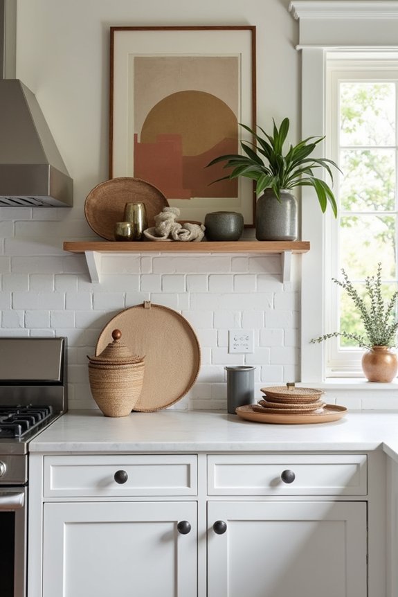
Why stop your backsplash at the cabinet line when you could let it keep going—climbing right up the wall like it owns the place? I learned this the hard way after staring at my awkward white gap for months, wondering why my kitchen felt incomplete.
Extending your backsplash offers several benefits:
Extending your backsplash creates visual continuity, enhances perceived height, and transforms your kitchen into a deliberately designed space.
- Visual continuity – Your materials flow uninterrupted, eliminating that jarring stop-and-start feeling
- Height enhancement – The upward extension tricks your eye into perceiving a grander space
- Architectural reinforcement – It bridges cabinetry and walls seamlessly, creating a built-in appearance
- Cohesive palette – Color and texture work together rather than clashing
This approach makes the space above your cabinets from overlooked area into deliberate design. Your kitchen suddenly reads as planned—like you made considered choices, not like you’re borrowing someone else’s aesthetic.
Brighten With Low-Maintenance Faux Greenery
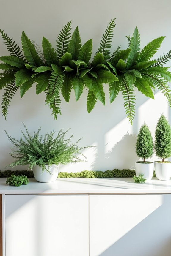
Once you’ve got your backsplash climbing the wall like it’s got somewhere to be, you’ll notice those cabinet tops still have a bit of a dead zone—that shadowy gap that makes your kitchen look like it’s holding its breath. I’ve stared at mine for months, wondering if plants could survive up there. Spoiler: real ones can’t, but faux greenery? A solid solution.
| Faux Option | Light Needs | Maintenance | Vibe |
|---|---|---|---|
| Trailing vines | None | Zero | Effortless |
| Succulents | Indirect | Dusting only | Trendy |
| Topiary | None | Annual refresh | Designer |
| Pothos | Flexible | Annual refresh | Natural |
One lush specimen beats a cluttered cluster. Pair it with seasonal accents for warmth without the watering guilt that haunts every plant parent.
Hang Mirrors to Reflect Light and Amplify Space
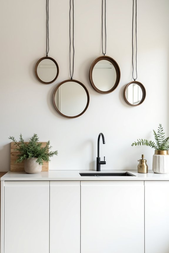
There’s something almost magical about hanging a mirror above your cabinets—suddenly, that dark corner where you’ve been squinting to read recipes gets a jolt of actual brightness, and your kitchen doesn’t feel like a cave anymore.
I’ve discovered that strategically positioned mirrors genuinely bounce light around your space. Here’s what makes this work:
- Mirror reflecting light amplifies natural sunlight without requiring rewiring
- Size matters—match your mirror to cabinet width for visual harmony
- Frame style should echo your kitchen’s personality, from sleek modern to ornate traditional
- Secure mounting prevents disaster during earthquake season or enthusiastic cabinet slamming
Choose a decorative piece with personality—something bold that works as a focal point. Your kitchen will finally stop looking like your aunt’s guest bathroom, and you’ll actually want to cook there.
Display Oversized Art or Sculptural Objects
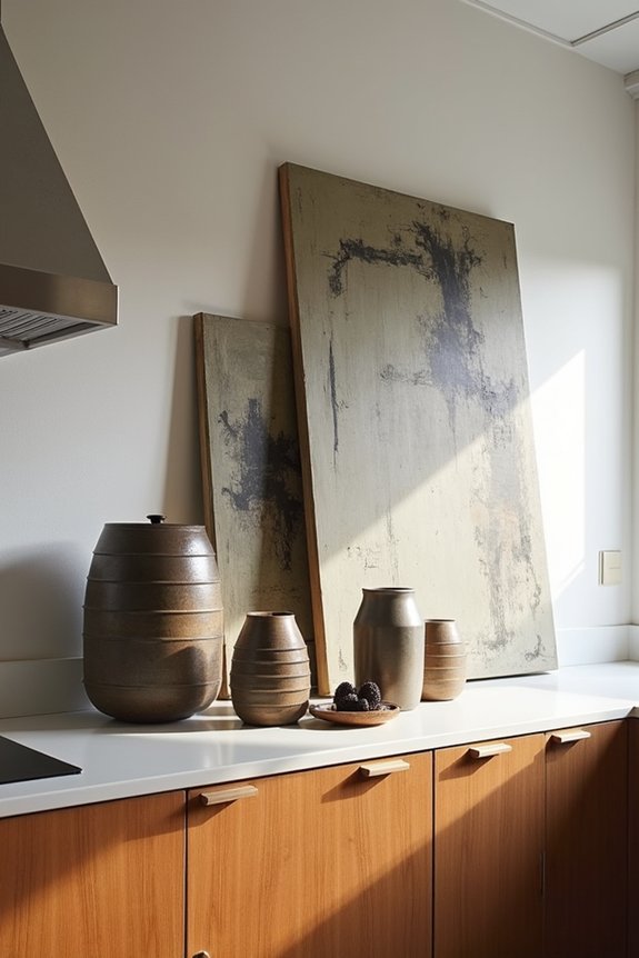
I’ve learned the hard way that oversized art above kitchen cabinets isn’t just decoration—it’s a power move that changes your kitchen from “mom’s kitchen” into something resembling an actual gallery, which my parents would’ve called wasteful but secretly envied. These pieces work because they’re unapologetically bold, drawing every eye upward like some kind of visual trick, and pairing them with neutral cabinets means your vintage surfboard or dramatic sculpture gets to be the centerpiece it was born to be. Sure, you’ll need proper mounting (because dropping a sculptural object into your cereal bowl at breakfast is peak chaos), but the payoff—that deliberate, intentional vibe—makes the effort feel less like home improvement and more like you actually know what you’re doing.
Statement Pieces Draw Eyes
How’d we all end up convinced that empty wall space above the cabinets was just asking for a dusty vase collection and regret? Here’s the truth: pieces with presence don’t just fill space—they improve it. I learned this the hard way after hanging a vintage surfboard above my kitchen cabinets, and suddenly my whole room felt more deliberate.
Bold pieces work because they:
- Draw your eye upward, creating visual interest beyond countertop clutter
- Anchor your kitchen’s personality without requiring daily maintenance
- Command attention through bold color or texture contrasts
- Establish a curated gallery vibe that shows you care about design
The secret? Strategic negative space keeps things from feeling suffocating. A designer once told me, “One killer piece beats ten mediocre ones.” She wasn’t wrong. Your space deserves that moment.
Curated Collections Tell Stories
When you stop treating the space above your cabinets like a holding pattern for things you’re too guilty to throw away, something shifts—suddenly you’ve got real estate for actual art. I used to display my mother’s ketchup-stained serving platters up there, convinced they’d become heirlooms. They didn’t. Instead, I arranged three oversized sculptural pieces—strategically spaced with breathing room between them. This cabinet decor trick works because odd-numbered groupings look deliberate rather than random. I paired a black metal sculpture with wood-toned accessories, anchoring everything securely because the last thing I needed was art raining down during dinner. The result? My kitchen finally looked like I’d visited a gallery instead of raided my parents’ basement. Your space deserves better than Chuck E. Cheese cups anyway.
Maximalist Impact With Purpose
- Anchor with one dominant piece—a sculpture, vintage sign, or bold painting that commands attention
- Pair complementary finishes to avoid visual chaos and maintain gallery-like cohesion
- Group supporting items in odd numbers (three or five) for balanced composition
- Consider wall color and cabinetry when selecting your primary work
The approach: One strong centerpiece outperforms a collection of minor items. Your cabinet space deserves a moment to shine.
Add Pattern With Wallpaper or Shiplap
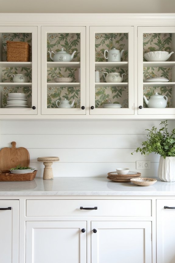
If you’ve ever stared at the blank space above your kitchen cabinets and thought, “That’s either going to look intentionally chic or like I gave up halfway through decorating,” you’re not alone—and wallpaper or shiplap might be exactly what you need to bridge that gap.
Here’s the thing: shiplap creates that architectural, coastal-meets-rustic vibe without demanding constant upkeep. Patterned wallpaper, meanwhile, introduces dimension that actually makes your cabinets pop—it’s like giving your kitchen a personality upgrade without rearranging everything.
I’ve learned that combining either option with small accents—baskets, greenery, maybe some artwork—prevents that “I bought one item and called it décor” feeling. The result? A space that feels styled with purpose, not accidentally sparse.
Install Floating Shelves for Open Storage and Display
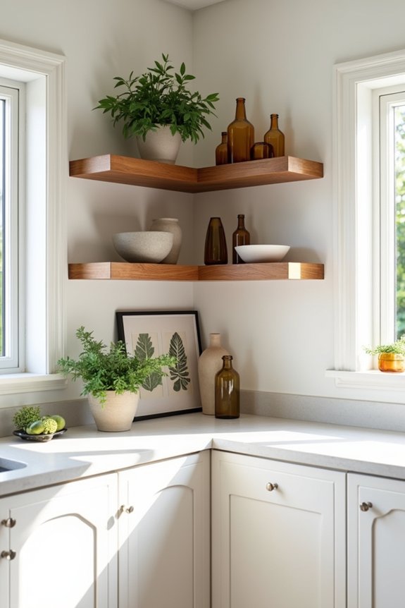
Floating shelves are basically the kitchen equivalent of finally organizing your junk drawer—except everyone can actually see them, which means you can’t just shove disappointment behind a closed door. I’ve learned that the space above your cabinets becomes genuine display real estate when you commit to floating shelves.
Here’s what actually works:
- Choose 8–12 inch depths for balance between accessibility and that “I have my life together” vibe
- Vary heights deliberately—not haphazardly like my spice rack situation
- Mix cookbooks with vases, bowls with greenery to dodge the “museum exhibit” aesthetic
- Add LED strips underneath because mood lighting fixes everything, as it turns out
Midcentury brackets feel intentional without screaming “trying too hard.” The result? That coveted space becomes functional art instead of a dust collector’s paradise.