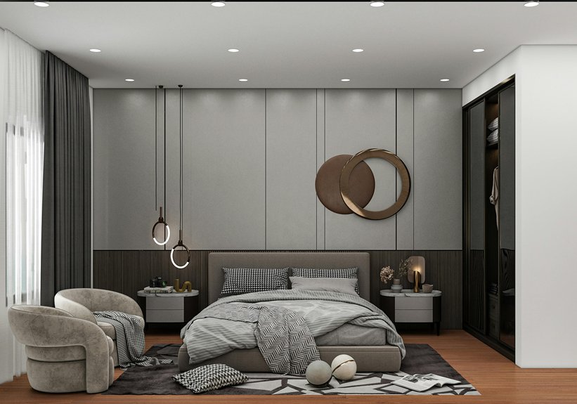
I’ve learned that decorating small spaces isn’t about jamming in more stuff—it’s about ruthless honesty. Master clutter control first; your furniture shouldn’t moonlight as a filing cabinet. Layer light colors and reflective surfaces to stretch walls mentally. Arrange zones with clear pathways, treat vertical space like real estate gold, and mount everything possible. Use mirrors opposite windows, blend textures strategically, and rotate seasonal accents to keep things fresh. The trick? Every piece earns its square footage or gets evicted. There’s far more to accomplish in cramped quarters by creating spaces that actually work.
Master Clutter Control and Strategic Storage
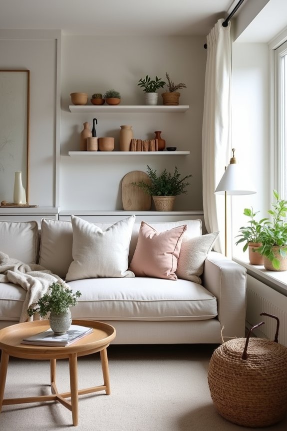
When you’re working with a small space, clutter isn’t just an aesthetic problem—it’s a physical one that’ll shrink your room faster than a wool sweater in hot water. I’ve learned that decluttering isn’t a one-time event; it’s a lifestyle choice—one I resist weekly while staring at Chuck E. Cheese cups multiplying like rabbits.
Strategic storage solutions create order from chaos. I’ve discovered vertical storage and built-ins maximize my height without eating floor space. Wall-mounted cabinets, hidden compartments in furniture, and slim units work effectively. Baskets and stylish bins keep things organized yet decorative—lightweight decor that doesn’t overwhelm tiny rooms.
Here’s the truth: portable storage options like PODS handle seasonal overflow, preventing that suffocating feeling. Regular reassessment stops reaccumulation. When pathways stay clear, I finally breathe easy.
Choose Light Colors and Reflective Surfaces
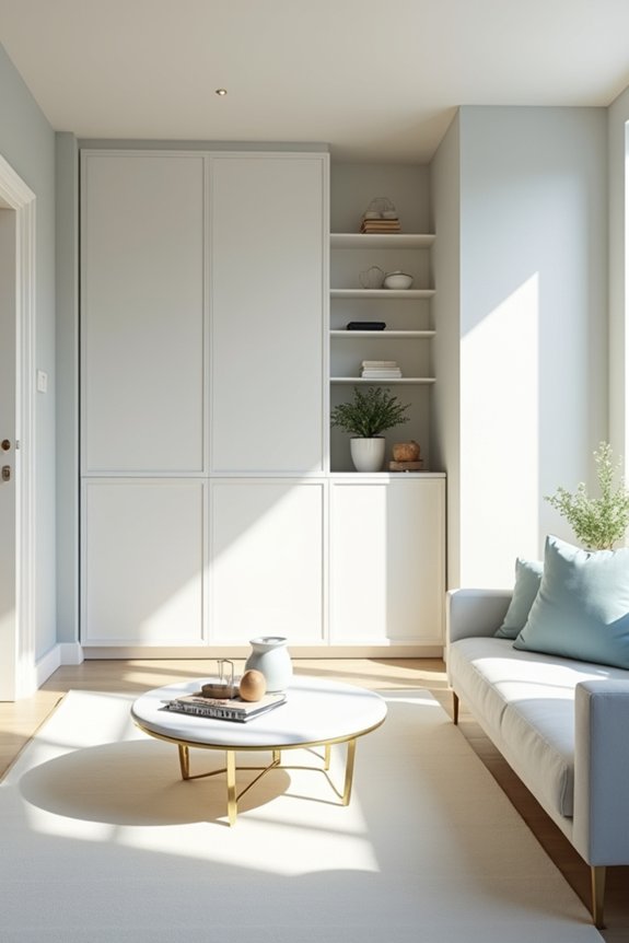
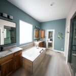
Light colors are basically the cheat code I wish I’d discovered before painting my daughter’s bedroom “Moody Teal Dream”—a decision that turned a 10×10 box into a cave where she now broods authentically.
Here’s what I’ve learned works:
- Paint with soft whites and lighter neutrals to extend your color palette into connected areas, creating visual continuity without walls demanding attention.
- Layer in reflective surfaces—lacquered finishes, polished mirrors, glossy accents—that bounce light around like tiny interior design boomerangs, visually doubling your square footage without adding bulk.
- Mix textures strategically with nubby baskets and ribbed surfaces to keep visual interest alive while maintaining that airy, bright space feeling.
Light colors aren’t boring; they’re your small space superpower.
Create Depth With a Cohesive Color Palette
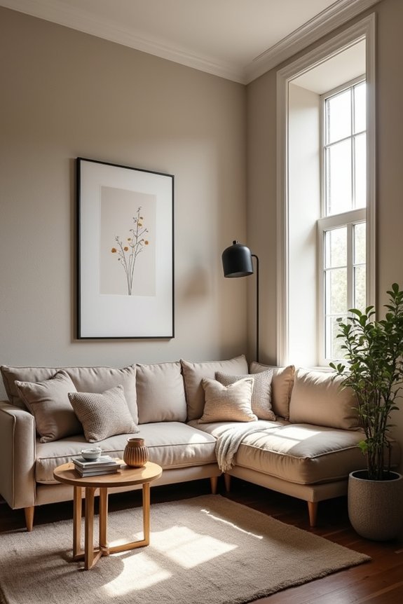
I’ve learned the hard way that slapping every color I love onto my walls is basically interior design sabotage—so I now lean on the 60-30-10 rule, letting a soft neutral dominate while my secondary shade plays support and one punchy accent color gets to be the show-off (kind of like how my parents insisted I focus on one extracurricular, which I promptly ignored). The method? I sneak that accent color through pillows, throws, and textiles instead of painting an accent wall that’ll haunt me in three years, because as designer Mario Buatta once said, “I believe in plenty of optimism and a little bit of fantasy,” but not when it involves committing to chartreuse trim. What I’m discovering is that this restraint—this strategic color arrangement—actually creates the illusion of depth, making my cramped bedroom feel less like a Chuck E. Cheese ball pit and more like a deliberate, considered space with room to breathe.
The 60-30-10 Rule
How’d I end up with seventeen different paint swatches taped to my living room wall, each one screaming “pick me” like desperate contestants on a reality show? I finally discovered the 60-30-10 rule—and honestly, it works well for us small-space dwellers.
Here’s what I learned:
- Assign 60% to your dominant color — soft, muted base hues that anchor everything without overwhelming
- Reserve 30% for secondary tones — slightly stronger shades that build visual interest and depth
- Use 10% for accent colors — brighter pops that add personality without creating visual clutter
This palette approach creates color balance and harmony. By anchoring my decor with one dominant color plus two supporting shades, I’ve created actual depth while preserving airiness. No more competing hues fighting for attention across walls, furniture, and textiles—just unified, breathing space.
Accent Colors Add Interest
Once you’ve nailed your 60-30-10 foundation, here’s where accent colors add real interest—darker and bolder tones bring personality to a bland room. I learned this the hard way after my living room looked like a hospital waiting room for three months straight.
Bold accessories and textiles are your practical tools. A jewel-toned throw pillow, deep artwork, or contrasting accent wall creates depth without draining your budget. Lighter walls become your canvas; darker accents stand out against them with natural visual impact.
| Accent Method | Best For |
|---|---|
| Single accent wall | Visual drama |
| Throw pillows | Budget-conscious updates |
| Statement artwork | Personality injection |
| Textiles & throws | Cozy contrast |
| Bold accessories | Flexible styling |
Think strategically—one darker element beats seventeen mismatched trinkets. Your cohesive palette stays intact while gaining the depth small spaces need.
Arrange Layouts to Prioritize Open Pathways
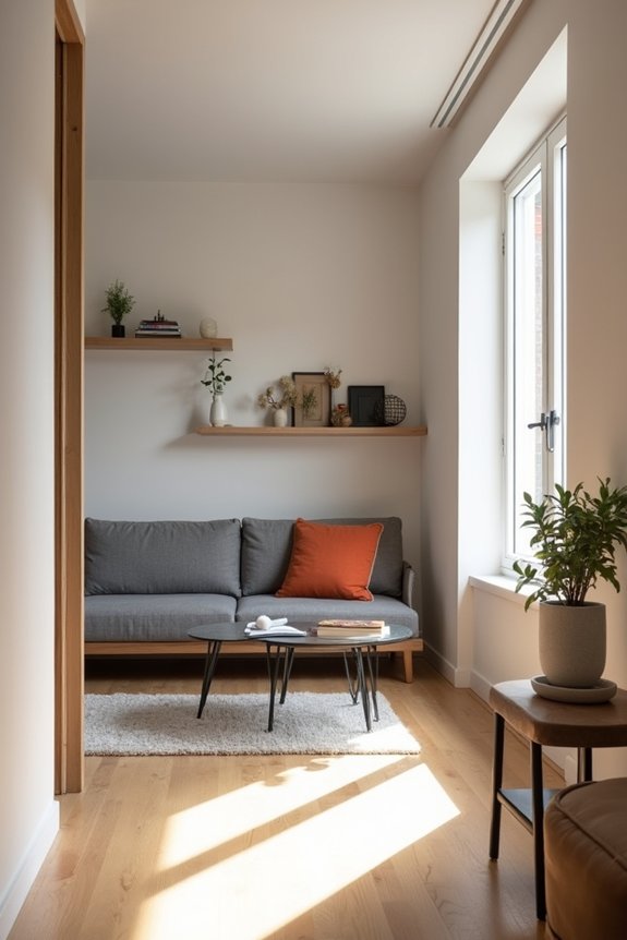
I learned the hard way that cramming furniture into the center of my living room—like some kind of cozy obstacle course—was basically asking for chaos, so now I push the big pieces against walls, maintain clear sightlines, and actually let people walk from the door to the kitchen without navigating a Chuck E. Cheese ball pit of ottomans. Grouping furniture into defined zones (seating here, work zone there) sounds obvious until you’re standing in a 200-square-foot apartment wondering why your sofa’s blocking half the room, but designers swear it works. The real benefit? Keeping those central pathways at least 36 inches wide so I’m not playing Tetris every time my kid spills ketchup and needs to move the couch.
Clear Sightlines And Flow
Why do small spaces feel smaller when you’ve crammed furniture into every corner like you’re preparing for a Chuck E. Cheese birthday party? I learned this the hard way. Clear sightlines and flow turn cramped rooms into places where you can actually breathe—and walk without performing gymnastics.
Here’s what changed my space:
- Ditch oversized rugs that anchor furniture in chaotic clusters; modular pieces instead create flexible zones without blocking views
- Mount storage vertically—shelves, cabinets, mirrors—freeing precious floor space while maintaining openness
- Design intentional traffic flow by positioning furniture to guide movement naturally from entry to key areas
Wall-mounted storage and vertical shelving work hard in small spaces. Small spaces don’t need less furniture; they need smarter arrangements. Designer Kelly Wearstler says it best: “Open pathways aren’t luxuries—they’re necessities.” That’s belonging.
Furniture Placement Against Walls
The wall’s your best friend in a small space—treat it like the VIP section at a concert, and suddenly your room has breathing room. I learned this the hard way after cramming my couch in the center like some sort of furniture rebel. By pushing my seating against the perimeter, I’ve reclaimed actual floor space. Wall-mounted storage? It works. Those floating shelves keep my floor uncluttered while my sightlines stay clear—no more tripping over ottoman legs at 2 a.m. Grouping furniture against walls creates functional zones without the crowding chaos. As design experts say, perimeter arrangement maximizes open pathways. My room finally flows like it’s supposed to, not like navigating a Chuck E. Cheese obstacle course. Strategic furniture placement changes claustrophobia into possibility.
Define Zones With Grouping
When you’ve got maybe 400 square feet to work with, cramming everything into one blob of furniture isn’t a layout—it’s a cry for help. I learned this the hard way after my couch blocked the kitchen entrance like a fabric barricade.
Here’s how I reclaimed my space:
- Cluster seating to define living zones—group your sofa, chairs, and table together, creating intentional neighborhoods rather than scattered chaos
- Use area rugs as invisible boundaries—they whisper “this is the dining zone” without screaming it
- Keep pathways sacred—stay clear of walking routes, because tripping over an ottoman while carrying coffee isn’t the vibe
Furniture grouping creates purposeful zones in small spaces. As designer Christine Dovey notes, “Visual order creates the illusion of space.” I’m finally that person whose apartment doesn’t feel like a Chuck E. Cheese explosion.
Maximize Vertical Space and Wall Real Estate
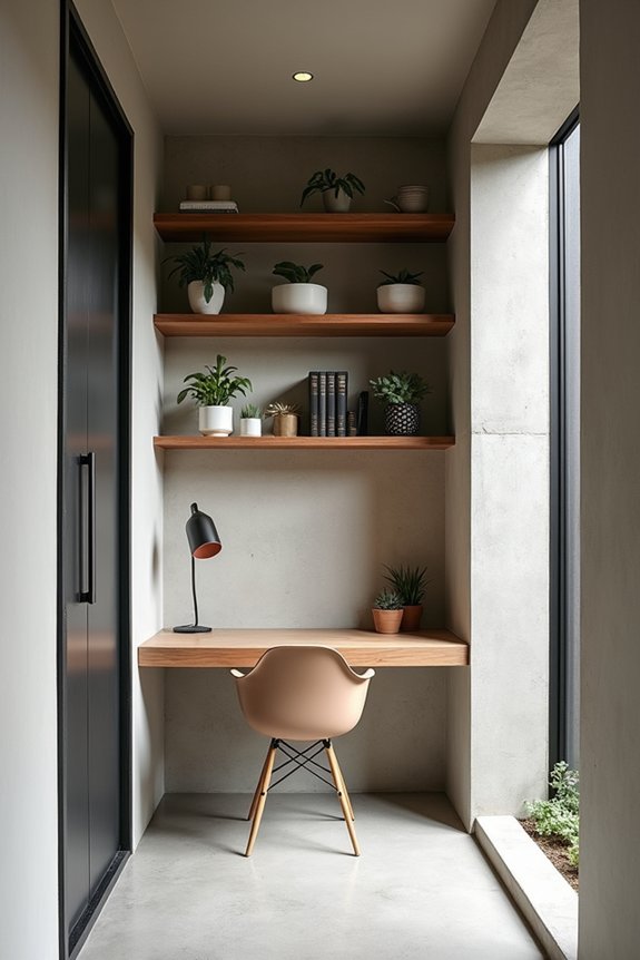
How’s this for a cruel irony: my tiny apartment has plenty of wall space but I’m treating it like precious real estate I can’t afford to develop. I’m finally ditching that logic. I’ve mounted my TV, installed wall storage, and hung ceiling-height curtains that actually trick visitors into thinking I own more than 400 square feet. Slim furniture—tall, narrow units instead of sprawling pieces—keeps my floor clear and sightlines open. Wall-mounted solutions and mirrors reflect light everywhere, visually extending my space vertically rather than horizontally. The eye travels upward, floor clearance feels spacious, and suddenly my shoebox doesn’t feel suffocating. Who knew walls weren’t just decorative backdrops? Turns out, they’re the real estate goldmine I’ve been ignoring.
Select Right-Sized Furniture With Built-In Storage
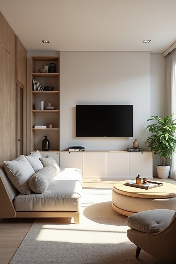
I learned the hard way that cramming an oversized sectional into a 200-square-foot bedroom—complete with hidden cup holders that somehow collected more Chuck E. Cheese tokens than actual storage—was a masterclass in self-sabotage, which is precisely why proportional pieces with built-in compartments work better. Hidden drawers in ottomans and leggy bed frames got my space from “hoarder’s paradise” into something my parents could visit without staging an intervention, proving that the right-sized furniture does what my impulse purchases couldn’t: it actually works. As designer Christopher Loyd says, “Small spaces demand intention,” and I’m convinced that intention starts by ditching the fantasy that you’ll use that decorative bench for sitting—embrace its real job as a ketchup-resistant storage unit instead.
Proportional Pieces Save Space
Ever notice how a full-size dresser in a studio apartment basically becomes an immovable monument to your poor life choices?
I’ve learned that proportional furniture—slim-profile pieces, specifically—actually saves your sanity. Here’s what I’ve discovered works:
- Beds with built-in drawers eliminate that awkward floor-space waste
- Ottomans with hidden compartments hide seasonal chaos (and ketchup-stained blankets)
- Wall-mounted floating shelves reduce visual weight dramatically
The trick isn’t downsizing everything—it’s choosing scale-appropriate pieces that function well. A designer once told me, “Your furniture shouldn’t shout; it should whisper.” Multi-functional designs create that airy feel without cramping your movement. Slim-profile seating keeps floor space open, making even tiny rooms feel less like storage units and more like actual homes. That’s the real win here—reclaiming space that’s genuinely yours.
Hidden Compartments Maximize Function
The real value emerges when you stop fighting your stuff and start hiding it instead. I’ve learned that hidden compartments and built-in storage reduce clutter—no more Chuck E. Cheese cups breeding on shelves like they’re reproducing. Multifunctional furniture works hard for you: ottomans concealing blankets, beds with drawers swallowing seasonal clothes, benches that open to reveal forgotten treasures.
| Furniture Type | Hidden Feature |
|---|---|
| Ottoman | Storage compartment |
| Bed frame | Under-bed drawers |
| Coffee table | Lift-top storage |
| Wall shelving | Integrated cabinets |
Space-saving design isn’t about minimalism—it’s about smart decluttering. Integrated surfaces keep your color palette consistent, reducing visual weight. Built-in storage solves problems quietly rather than drawing attention to them. You’ll find yourself actually using these pieces because they work *with* you, not against your sanity.
Layer Lighting and Use Mirrors to Amplify Space
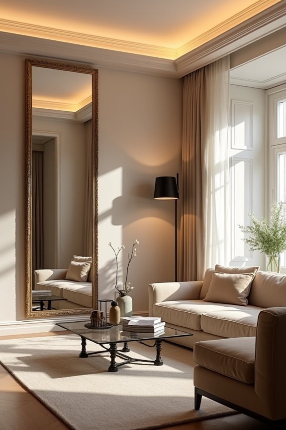
How’s your tiny living room doing—still pretending it’s bigger than a closet?
Your tiny living room doesn’t need apologies—it needs strategy. Mirrors and lighting are practical tools against claustrophobia.
I get it. My studio apartment mocks me daily. But here’s what works: layering lighting and strategically positioning mirrors changes cramped quarters into spaces that actually function better.
- Install wall-mounted lighting with slim profiles—no floor lamps hogging precious square footage or tripping hazards when you’re navigating around that one chair.
- Position large mirrors opposite windows to bounce daylight across surfaces, effectively doubling your perceived size without demolishing walls.
- Combine ambient, task, and accent lighting to create visual depth while keeping reflective surfaces and light-colored furnishings working overtime.
Designers call this “spatial illusion.” I call it survival. Your small space doesn’t need apologies—it needs strategy. Mirrors and layered lighting aren’t fancy; they’re practical tools against claustrophobia.
Bring Warmth Through Texture and Subtle Accents
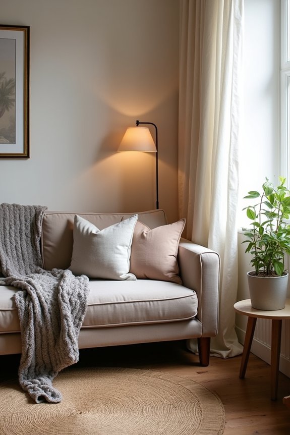
So you’ve got your mirrors bouncing light everywhere and your wall sconces aren’t stabbing you in the shin—good. Now let’s talk texture, because bare walls feel like a Chuck E. Cheese without the animatronics.
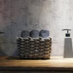
I’m layering in woven accessories and soft textiles using a color palette that works together. A nubby basket holds blankets, ribbed pitchers catch light, and burlap-trimmed items add depth without cluttering my already-cramped square footage.
The trick? Pair matte and glossy surfaces strategically—glossy accents reflect light while tactile details in wood grain and natural fibers make the space feel lived-in. I’m stacking pillows and throws across my sofa, creating warmth through subtle textures that whisper “cozy” instead of shouting it.
Your small space doesn’t need apologies—just smart, intentional accents.
Maintain Visual Freshness With Seasonal Updates
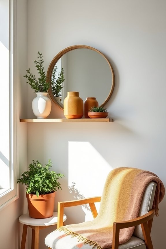
Why do we act like swapping a throw pillow is somehow cheating on interior design? I’ve genuinely stressed over rotating seasonal textiles—as if someone’s judging my throw blanket choices. But here’s the truth: seasonal updates keep small spaces feeling intentional, not stale.
- Swap lightweight decor seasonally to refresh without cramming your already-tight square footage
- Exchange heavy curtains for sheer treatments that maximize natural light and perceived space
- Introduce mirrors or a single focal art piece to alter visual weight
I’m talking rotating jute accents for velvet, swapping candle scents, refreshing wall displays. These moves maintain visual freshness on clutter-free surfaces while keeping seasonal textiles and textures working overtime. Your small space isn’t boring—it’s just waiting for permission to change with each season.
Why Small Spaces Don’t Have to Feel Small?
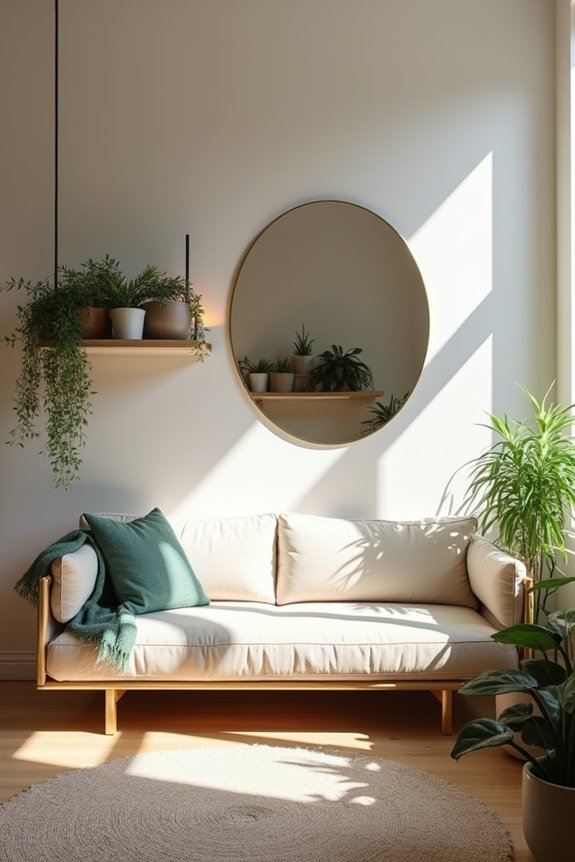
There’s this moment—usually around 3 p.m. on a Saturday—when I’m standing in my shoebox apartment surrounded by furniture that costs more per square inch than my rent, and I think: *these designers aren’t living in reality*. But here’s the thing—they’re onto something. Light-colored walls actually do reflect light, making spaces feel larger. Mirrors multiply that effect brilliantly. I’ve discovered vertical storage draws my eye upward, stretching perceived height without consuming floor space. Multi-functional furniture with hidden compartments? It works. They eliminate clutter that makes rooms feel cramped. A consistent color palette across connected spaces creates flow, not fragmentation. Strategic lighting—ambient, task, accent—maximizes natural light. Suddenly, my cramped quarters don’t feel suffocating. They feel deliberate. Designed. Mine.