I’ve watched my small apartment change—not through luck, but through nine deliberate design moves that work on your perception. Float furniture away from walls, ditch surface clutter, and hang curtains ceiling-high to stretch vertical space. Layer lighting, anchor with one substantial rug, and let mirrors bounce light around. Right-size your pieces, paint thoughtfully for your natural light, and keep sightlines open through smart storage. Each move builds on the others, creating the illusion of room to breathe where clutter once dominated—and there’s more tactical territory worth exploring.
Start With Layout: Move Furniture Away From Walls
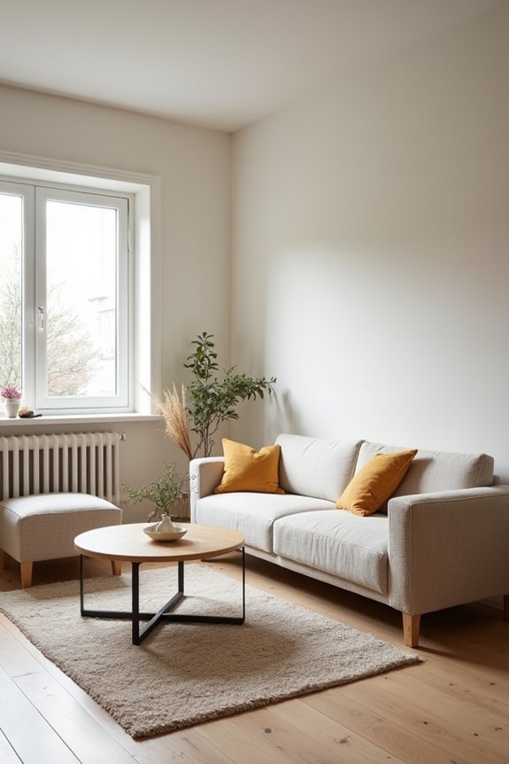
Then I learned the truth: floating furniture creates breathing room.
When I pulled my sofa away from the wall, something shifted. Suddenly, my cramped living room felt deliberate rather than desperate. That openness? It’s not an accident—it’s strategy. By anchoring the layout with one substantial piece and establishing clear sightlines, I created actual livable space from what felt like a shoebox.
The lesson stuck: small spaces don’t need less furniture. They need smarter arrangement.
Declutter Surfaces to Create Breathing Room
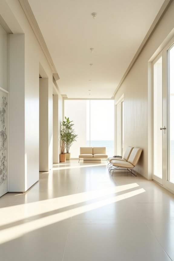
Once I’d mastered the furniture shuffle, I realized I’d been solving the wrong problem. My surfaces—nightstands, shelves, windowsills—were drowning in stuff: stray Chuck E. Cheese cups, ketchup-stained fabric scraps, things I couldn’t name. Decluttering these spaces changed everything.
When I cleared my surfaces, something happened. My room actually breathed. That breathing room—the empty space between objects—made my small space feel larger, less suffocating. Every item now has a designated place. Related things cluster together; my color palette stays unified across zones.
Designers call this visual rest. I call it sanity. Minimal visible clutter expands perceived room size. Integrated storage, floating shelves—they reduce bulk without sacrificing function. My entry now feels calm, navigable, almost spacious.
That’s not furniture rearrangement talking. That’s surfaces finally getting air.
Paint Walls for Your Room’s Natural Light
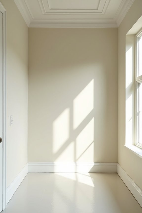
I learned the hard way that slapping Benjamin Moore’s “Swiss Coffee” on my north-facing bedroom was like painting a cave—turns out, less natural light means darker colors actually make spaces feel bigger, not smaller, which my interior-designer friend gleefully reminded me while I stood there covered in primer regret. The real trick is matching your wall’s LRV (that’s light reflectance value, a fancy term for “how much bounce-back you get”) to what Mother Nature’s actually giving you; high-LRV colors like whites work great in bright rooms, but lower LRVs can ground darker spaces and somehow trick your brain into thinking the walls receded, which is the opposite of what my mom always screamed about painting things dark. So before you grab paint swatches like you’re shopping for emotional support, honestly assess whether your room’s drowning in sunlight or pretending to be a bat cave—because saturation and light levels working together are what actually make small spaces function, not wishful thinking.
Light Levels Shape Color Choices
Why do some rooms practically glow while others feel like caves you’re painting by flashlight? It’s all about how light actually enters your space—and honestly, I’ve learned this the hard way. Natural light determines everything. In bright, sun-soaked rooms, I’d slap on high-LRV paint thinking I’d nailed it, only to create this washed-out void where color died. Meanwhile, dim corners demanded richer hues—deep teals that paradoxically made everything feel spacious and comfortable.
| Light Condition | Best Paint LRV | Color Strategy |
|---|---|---|
| Bright, Direct | 65+ | Saturated tones prevent washout |
| Moderate Light | 55-65 | Versatile, balanced options |
| Low, Indirect | 45-55 | Rich darks add depth |
| Very Dim | 40-50 | Deep jewel tones expand feel |
| Mixed Exposure | 50-60 | Cool undertones add dimension |
Your paint color isn’t just decoration—it’s architecture responding to light.
LRV And Saturation Balance
we pick a color we love, slap it on the wall, and then wonder why our inspiration looks like a completely different room. The culprit? Ignoring LRV and saturation balance.
I learned this the hard way after painting my apartment a saturated navy that devoured light like my toddler devours ketchup on white furniture. The fix? Higher LRV values—around 65+—keep small spaces feeling open and airy. But here’s the trick: don’t just grab the palest, washed-out light color available. Instead, balance brightness with saturation. A soft, lightly saturated sage reads fresher than a chalky, desaturated beige because it actually has personality while maintaining that spacious feel. Your walls deserve better than Chuck E. Cheese ambiance.
Hang Curtains Higher to Stretch Vertical Space
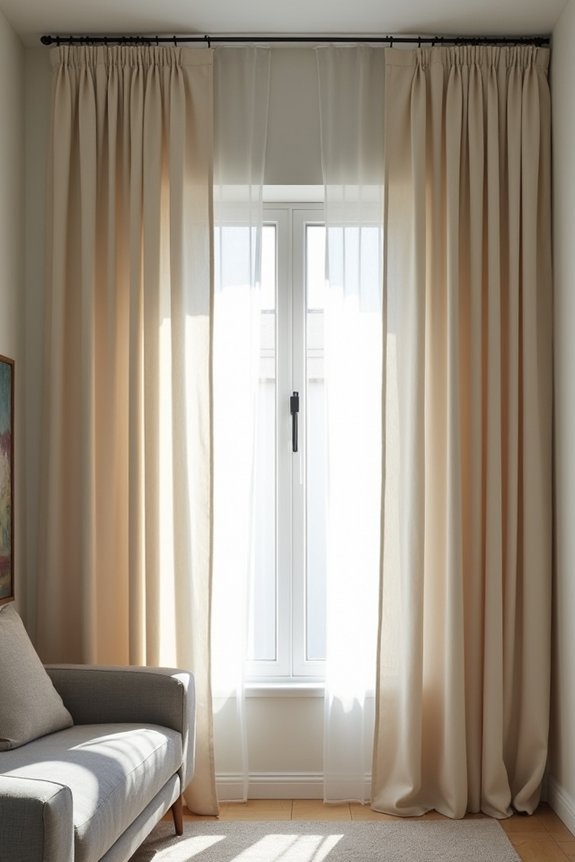
I used to hang my curtains like my parents did—smack against the window frame, which basically announced to everyone that my ceilings were shorter than a Chuck E. Cheese animatronic. But then I learned that mounting the rod two-thirds up toward the ceiling actually tricks your eye into thinking the walls stretch higher, and suddenly my cramped bedroom didn’t feel like a glorified closet. Now I extend those panels all the way to the floor, creating one unbroken line of fabric that makes the space feel less like a shoebox and more like an actual room where humans live.
Rod Placement Above Molding
How’s this for a design revelation: hanging your curtain rod higher than the window molding actually makes your ceilings look taller? I know—sounds counterintuitive, but it’s just geometry. I spent years letting my rods sit where they “belonged,” then felt disappointed when my apartment still felt cramped. The trick? Mount yours about two-thirds up toward the ceiling. This curtain height creates what designers call a ceiling illusion, stretching your walls vertically without knocking down a single one. Pair it with drapery extension that floats one inch above the floor—no bunching, no ketchup stains visible—and you’ve got continuous lines that elongate everything. Your space suddenly feels larger. It’s straightforward, honestly.
Floor-To-Ceiling Visual Effect
Before you dismiss this as yet another design myth—right up there with “dark paint makes rooms cozy” and “your mother-in-law’s opinions matter”—let me break down the geometry that actually works.
When I finally hung my curtains near the ceiling instead of where the window frame demanded, something clicked. Here’s why you’ll want to join this vertical approach:
- Elongated walls – Panels stretching floor-to-ceiling create an uninterrupted line that tricks your eye into seeing height
- Maximized window presence – Your windows suddenly feel grander, less apologetic about their modest size
- Continuous rhythm – The visual flow upward draws attention skyward, making ceilings feel taller
Pair these floor-to-ceiling curtains with light fabrics, and you’ve engineered a vertical illusion without sacrificing that airy, open feeling. Your space doesn’t just look bigger—it functions with better proportions.
Elongating Walls With Height
Positioning rods two-thirds up from the window stretches vertical space dramatically. Your walls elongate. Your eyes travel upward. Full-height panels floating an inch above the floor create visual rhythm that makes compact rooms feel expansive, like your ceilings actually breathe.
As designers say, “height is free real estate.” Even my mom—who once warned me that “tall curtains collect dust like Chuck E. Cheese cups”—admits this trick works. Elongating walls through curtain height? That’s not decoration. That’s architecture hacking.
Right-Size Your Furniture to Your Room
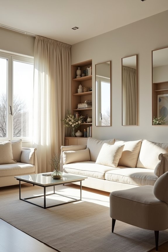
Most of us commit the same furniture crime: we cram a dollhouse sofa next to a nightstand-sized coffee table, then wonder why our living room feels cramped and cluttered.
Here’s the truth about small space furniture scale: oversized pieces actually make rooms feel bigger, not smaller. I learned this the hard way after my parents’ contradictory advice—Mom insisted on cramming everything in; Dad wanted nothing at all.
Consider these essentials:
- One substantial sofa paired with a proportional rug creates visual anchor points
- Fewer, larger pieces beat numerous tiny ones for clearer sightlines
- Floating furniture inches from walls improves balance and perceived openness
The trick? Match your seating, storage, and rug scale to your room’s walls. Yes, that means occasionally leaving space empty.
Use a Larger Rug to Anchor and Unify
Your living room doesn’t need wall-to-wall carpet—it needs a rug that actually works. I learned this the hard way, after years of tiny rugs that made my space feel like a fragmented mess. Here’s the thing: a larger rug anchors your seating group and creates that cohesive area designers focus on. It’s counterintuitive, I know—bigger rug in a small space feels risky, like inviting chaos. But it genuinely expands perception.
| Rug Placement | Impact | Result |
|---|---|---|
| Small, centered | Fragments space | Cramped feeling |
| Extends beyond furniture | Anchors seating | Unified, spacious |
| Covers key pieces | Unifies layout | Clear, deliberate design |
The trick? Make sure front sofa legs and your coffee table land on it. Measure around entrances too—you’re not creating obstacles, you’re creating a sense of belonging. That’s the design principle at work.
Multiply Light and Space With Mirrors
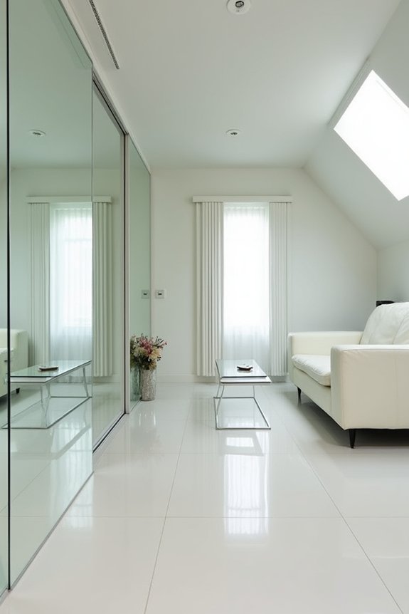
I learned the hard way that scattering mirrors everywhere—like some kind of funhouse reject—only amplifies visual chaos, so I strategically placed one large mirror across from my window and watched my cramped living room suddenly feel twice as deep, twice as bright, the reflected light bouncing around like it actually wanted to be there. Designers call this “extending sightlines,” which sounds fancy, but really it’s just tricking your brain into thinking the space keeps going, and honestly, that’s the kind of delusion I’m here for. Pair that mirror with light walls and transparent furniture—avoid the glare situation my mom created with her chrome collection—and you’ve basically given your small space architectural superpowers without renovating or, heaven forbid, actually moving to a bigger place.
Strategic Mirror Placement
Why do mirrors feel like the cheat code nobody tells you about? I used to cluster three small mirrors like some misguided gallery installation—visual noise disguised as design. Strategic placement changes everything.
Here’s what actually works:
- Position mirrors opposite windows to bounce natural light around and deepen your space perception—it’s like you’ve suddenly gained square footage you didn’t pay for
- Go vertical with tall, leaner mirrors to reinforce upward movement and trick ceilings into feeling genuinely higher
- Choose one substantial mirror over multiple small ones to maintain clear sightlines and avoid that chaotic thrifted-store energy
Designer Nate Berkus says mirrors function as architectural tools, not fillers. Pair them with open furniture layouts, and you’re not just reflecting light—you’re fundamentally reshaping how your space works. It’s the sense of actually having room to exist.
Reflective Light Amplification
When you’ve got a shoebox apartment and the only natural light comes from a kitchen window the size of a postage stamp, mirrors stop being decorative accessories and start working like actual physics. I learned this the hard way—after my mom insisted my dorm room needed “brightening up” (her code for: this cave is depressing). Placing a large mirror across from that tiny window literally doubled my light and extended sightlines, tricking my eyes into believing I had actual square footage. The space felt different. Suddenly, the reflected glow bounced around, amplifying what little sun existed. That’s reflective light amplification in action—mirrors multiplying both light and space simultaneously, turning cramped quarters into something that doesn’t feel like a filing cabinet with a bed.
Depth and Sightline Extension
How’s this for a design paradox: the thing that makes your apartment feel smaller is often the thing staring back at you in the mirror—namely, yourself squished into a corner because you’ve got nowhere else to go.
I learned this the hard way. My living room felt like a shoebox until I positioned a large mirror across from my window. Suddenly, sightlines extended infinitely, and depth materialized in front of me.
Here’s what actually works:
- Place mirrors opposite windows to bounce natural light and amplify openness
- Use vertical leaners to draw eyes upward, tricking your brain into perceiving height
- Avoid scattering small mirrors everywhere—one strategic reflective surface beats visual clutter every time
Pair your large mirror with light-colored walls and minimal furniture. That’s when you’ll notice the real difference—your cramped quarters finally have room to exist.
Hang Large Art to Expand Wall Boundaries
Before I learned this trick, my living room looked like a museum gift shop had exploded—tiny frames clustered together like they were huddling for warmth, each one screaming for attention and collectively making the space feel cramped and chaotic.
Then I discovered large artwork. One substantial piece became my visual anchor, changing how the room functioned. Unlike those scattered postcard-sized frames, a single gallery-worthy work draws your eye across the room, making walls feel further apart. I hung mine at eye level—suddenly, the space had room to breathe.
The mechanics? Large artwork doesn’t compete; it commands. Pair it with carefully scaled surrounding items, and your gallery walls read as deliberate and cohesive. Your brain stops counting frames and starts imagining possibilities.
My designer friend calls it “strategic focus.” I call it finally graduating from chaotic clusterer to actual adult.
Layer Your Lighting to Brighten Dark Corners
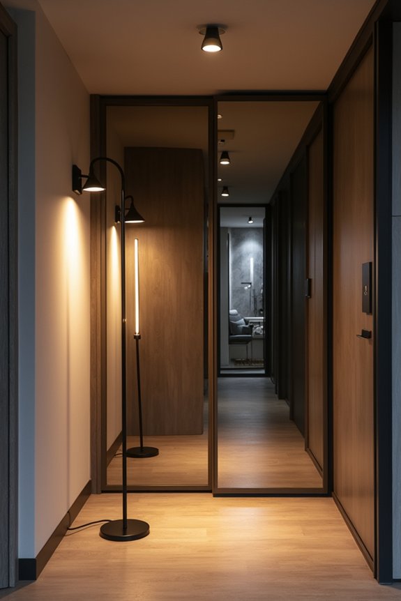
Why do dark corners feel like tiny prisons?
I used to think my cramped living room was cursed—until I discovered layered lighting. Instead of relying on one overhead fixture (which, let’s be honest, makes everything look like a dentist’s office), I combined three types of light sources to create actual brightness and a space illusion that works.
Here’s my approach:
- Overhead lights paired with table lamps to eliminate shadowy dead zones
- Floor lamps positioned strategically to brighten neglected corners and add depth
- Reflective surfaces working alongside these layers to amplify light naturally
The result? My small space doesn’t feel cramped anymore. Layered lighting doesn’t just banish darkness—it changes how you perceive the room. Sightlines extend, walls recede, and you’re not squinting like you’re trapped in a Chuck E. Cheese ball pit.
Maintain Open Sightlines Through Smart Storage
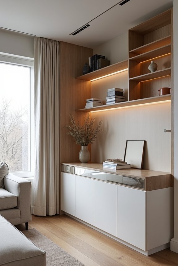
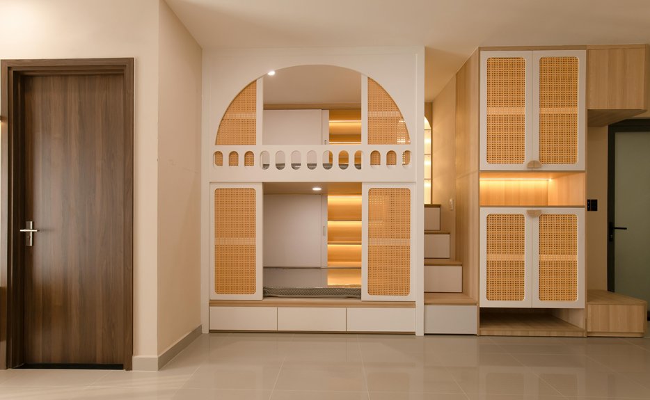
Once you’ve banished the shadows, you’ll notice something equally depressing: all your stuff. I’m talking about the Chuck E. Cheese cups multiplying like rabbits, the ketchup-stained blankets, the mysterious LEGO collections. Here’s the thing—you can’t actually live in a small space without storage, so you’ve got to get strategic. I’ve learned that keeping sightlines open means choosing furniture with legs, decluttering ruthlessly, and hiding chaos in stylish baskets. It’s not about owning less (impossible with kids), it’s about making what you own *disappear*.
| Storage Type | Best For | Visual Impact |
|---|---|---|
| Storage ottomans | Living rooms | Invisible clutter |
| Bed drawers | Bedrooms | Zero floor waste |
| Floating shelves | Any room | Open, airy feel |
| Baskets | Entryways | Contained chaos |
| Coffee tables | Living spaces | Hidden compartments |
Smart storage turns chaos into calm.