I stared at my blank 14-foot wall and realized doing nothing felt worse than doing something badly, so I started with one bold focal point—a massive artwork or mirror that anchors everything.
Then I layered in a renter-friendly oversized piece, considered paint or removable wallpaper, added picture lights for museum-quality glow, and anchored it all with a console table.
Strategic sconces, gallery walls, and intentional furniture placement create breathing room instead of that haunting emptiness.
Skip the tiny frames and dinky shelves—they’ll just emphasize the void.
The real trick? Stop treating empty space like failure, and start building outward.
Start With a Single Bold Focal Point
How many times have you stared at a blank wall and felt that creeping panic—the one that whispers you’re about to make a design mistake that’ll bother you for years?
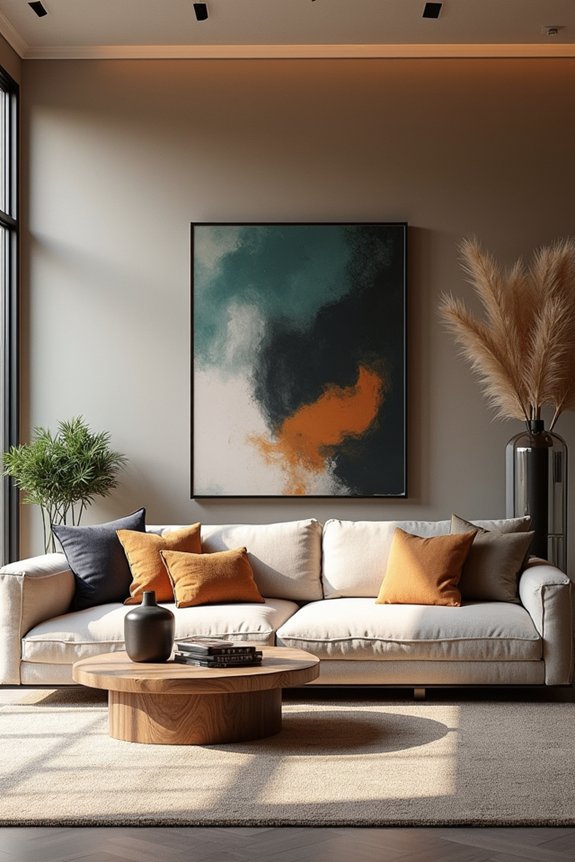
I get it. I’ve been there, surrounded by paint swatches like I’m choosing a lottery ticket. Here’s what works: pick one bold piece—a large artwork, a statement wall feature, whatever appeals to you—and build everything around it. This single piece becomes your design anchor, preventing that overwhelming feeling of “what now?”
Designer Kelly Wearstler puts it well: “A focal point gives a room purpose.” One powerful element stops the wall from feeling empty or chaotic. No more decision paralysis. Just one confident choice that makes the whole room come together.
Pick a Renter-Friendly Option: Oversized Art or a Mirror
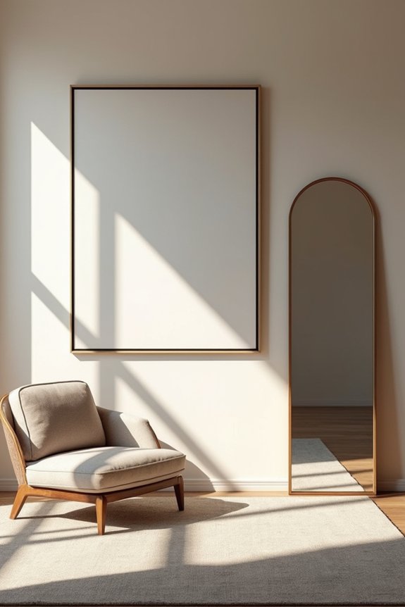
So here’s the thing about renting—you can’t paint, you can’t drill, and yet you’re somehow supposed to make a bare wall look intentional instead of like you just moved in last Tuesday. Enter oversized art or a mirror: a practical solution for renters. I’ve learned the hard way that one large piece beats a scattered gallery of tiny frames (and the seventeen nail holes they’d require). A large mirror bounces light around, making your space feel less like a studio apartment and more like somewhere adults actually live. Oversized art? It demands attention, drowning out that nagging voice asking why you still have Chuck E. Cheese cups on your shelf. Use removable picture hangers, tension rods, or adhesive strips. No landlord drama. Just one bold choice that finally makes your wall belong to you.
Go Permanent: Paint an Accent Wall or Add Wallpaper
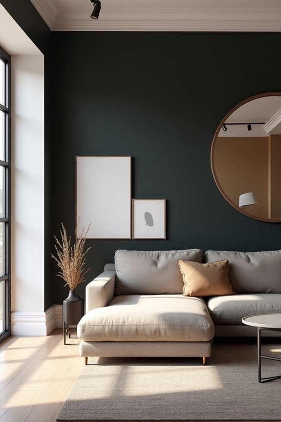
If you’re ready to stop pretending that renter-friendly phase is forever—I get it, I’ve lived with the same beige walls for three years—then an accent wall or wallpaper might be your moment to commit, and I’m here to walk you through the color and pattern choices that’ll actually look intentional rather than like you panicked at the paint store. You’ll want to pick a color that either whispers sophistication (dusty rose, pale pink) or declares itself boldly (bright azure, olive green against white), paired thoughtfully with your existing furniture so the whole room doesn’t feel like a Chuck E. Cheese explosion of competing visuals. Then there’s wallpaper—removable or permanent—which gives you patterning possibilities and the delicious flexibility to swap things out when your taste inevitably evolves, because let’s be honest, we’re all one Instagram scroll away from wanting something completely different.
Accent Wall Color Selection
Why do we always pick the color that makes us look like we’re living inside a bruise?
I’ve learned the hard way that accent wall color selection requires actual strategy, not just grabbing whatever paint sample doesn’t clash with your existing Chuck E. Cheese cup collection. You’ve got to consider your room’s size, natural light, and current palette—otherwise, you’ll end up with that one wall screaming while everything else sits awkwardly silent.
Start by repeating your accent color through textiles and accessories. That dusty rose? Echo it in throw pillows. Olive green? Weave it into your curtains. This approach creates balance in the space without overwhelming it, establishing visual harmony that doesn’t require professional intervention or significant expense.
Wallpaper Pattern and Installation
Once you’ve nailed your accent color, there’s the question of whether you’re actually going to commit to it—and that’s where wallpaper enters the chat like a friend offering both temporary tattoos and actual tattoos at the same party. I’ve learned that removable wallpaper exists for people like me: those who panic-change their minds faster than my toddler spills ketchup on fabric.
Peel-and-stick options let you test-drive bold patterns without permanent regret. Want oversized florals? Go for it. Geometric shapes that scream “I have my life together”? Install away. For something truly distinctive, consider large-scale prints—think 3 by 5 feet—from emerging artists or budget retailers.
The beauty? You’re not actually trapped. Your accent wall becomes a mood ring for your living room’s personality.
Create a Gallery Wall for Curated Impact
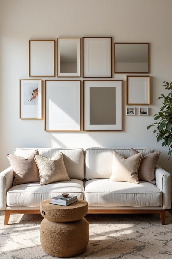
I learned the hard way that throwing every art piece I own onto a wall creates chaos, not curated brilliance—so I started clustering my photos, prints, and canvases in balanced grids at eye level, mixing frame styles while keeping a consistent color story (mine’s blacks and golds, because apparently I’m fancy now). Layout strategy matters more than I’d admit to my parents, who somehow expect gallery-wall perfection while their living room sports a faded Monet print above a Chuck E. Cheese calendar from 2019. Thoughtful curation means balancing those prominent pieces with smaller supporting works—creating visual rhythm instead of the visual assault I’d accidentally engineered before.
Gallery Wall Layout Strategies
If you’ve ever stared at a blank wall and thought, “I’ll just wing it,” only to end up with frames hanging at angles that’d make an interior designer weep, you’re not alone—and that’s exactly why gallery wall layout strategies exist to save us from our own chaotic impulses.
Before you grab a hammer, I plan my gallery wall on the floor using paper templates. This prevents the inevitable regret of nail holes everywhere. Here’s what actually works:
- Anchor placement: Start with a central piece at eye level, then build outward in a grid or salon-style layout
- Spacing matters: Use 2–3 inches between pieces for tight galleries or 4–6 inches for breathing room
- Unified vision: Match frame colors or themes to make mismatched pieces work together as part of a deliberate design
Your walls—and your sanity—will thank you.
Curating Art Pieces Thoughtfully
Thoughtful curation means mixing mediums, colors, and sizes while maintaining visual harmony. I pair matching frames with intentionally mismatched ones, creating that eclectic-yet-polished vibe. The real trick? Balancing prominent pieces with smaller supporting works prevents your gallery wall from screaming for attention like an overstimulated toddler at Chuck E. Cheese.
That strategic clustering from your seating area? It establishes the visual anchor you didn’t know you needed.
Install Wall-Mounted Shelves or Display Units
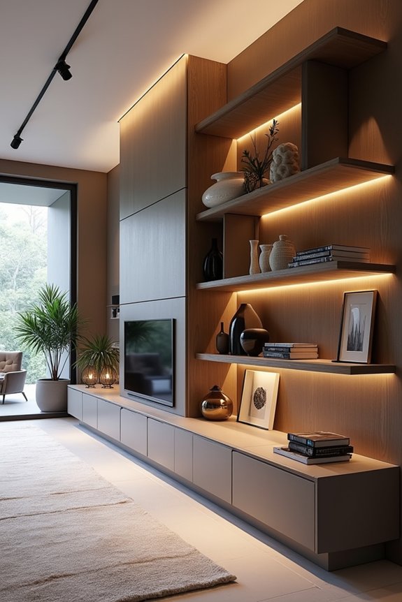
How many times have you stared at that cavernous wall and thought, “That’s just begging for something besides existential dread”? I’ve been there—surrounded by blank space like I’m living in a furniture showroom reject pile. Wall-mounted shelves and display units fill that void with actual substance.
I’m talking about floating shelves that don’t scream “temporary college apartment,” but rather whisper sophistication. Here’s what works:
- Vertical floor-to-ceiling shelving adds layered depth while storing books, plants, and those heirlooms your mom insists you display
- Wall-mounted display units flanking your TV create chic framing that draws eyes exactly where you want them
- Adjustable picture ledges let you swap art without punching more holes in drywall
Your wall’s finally earning its rent in this living room.
Add Architectural Detail: Crown Molding, Shiplap, or Wainscoting
I’ll be honest—when I first considered crown molding, wainscoting, and shiplap for my living room’s blank wall, I panicked at both the price tag and installation complexity, wondering if I’d end up with something that looked like my parents’ 1987 den (architectural details everywhere, taste nowhere). But here’s what I’ve learned from designers and my own trial-and-error: crown molding runs $3–8 per linear foot installed and creates vertical lift, while shiplap ($500–2,000 for a feature wall) adds texture without the commitment of full remodeling, and wainscoting—the trickiest financially at $1,500–4,000—balances a cavernous room by anchoring the lower wall. The real benefit comes when you consider how each element plays with your room’s proportions: crown molding draws the eye upward (goodbye, popcorn ceiling anxiety), horizontal shiplap lines make height feel deliberate rather than gaping, and vertical board-and-batten detailing practically directs your gaze upward, which frankly beats watching guests spill their Chuck E. Cheese cups on the carpet while staring at blank drywall.
Installation Methods And Costs
When you’re ready to stop pretending your living room walls are intentionally blank canvases and actually do something about it, architectural details like crown molding, shiplap, and wainscoting aren’t just Pinterest fantasy—they’re practical fixes that’ll make your space feel more refined without requiring you to sell a kidney.
Here’s what you’re actually looking at:
- Crown molding costs $3–$15 per linear foot installed, depending on profile complexity and material
- Shiplap runs $1–$10 per square foot, plus labor that’ll either drain your wallet or your sanity (sometimes both)
- Wainscoting typically costs $2,000–$5,000 for a large room, including materials and finishing
DIY installation saves money but demands patience—something most of us lack alongside decent organizational skills. Professionals handle it faster, so your walls actually look deliberate rather than like your dad’s garage project gone rogue.
Visual Impact And Room Proportions
Now that you’ve got a budget in mind, it’s time to address that blank wall—because empty space reads as unfinished rather than intentional. Architectural details like crown molding, shiplap, and wainscoting serve practical purposes beyond aesthetics; they’re visual tools that create rhythm on large walls by directing your eye upward and increasing perceived ceiling height, which matters when you’re dealing with expansive drywall.
| Detail | Effect |
|---|---|
| Crown molding | Frames ceiling, adds elegance |
| Shiplap | Creates texture, softens scale |
| Wainscoting | Adds horizontal grounding |
| Board-and-batten | Introduces sculptural depth |
| Extended trim | Balances oversized wall space |
Pair lighter wall colors with these details—they’ll sharpen proportions without overwhelming your room.
Anchor the Space With a Console Table and Art
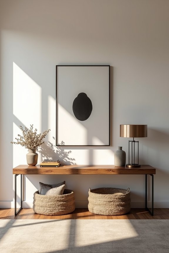
Three things’ll help a cavernous living room wall move past bare walls—a console table, bold art, and the restraint not to cram every decorative object you’ve ever owned onto said console.
Here’s what I’ve learned:
- Choose a console with clean lines. This prevents your wall from looking like a cluttered thrift store shelf.
- Pair it with one strong piece of art—something bold enough to anchor the room without screaming for attention like my toddler at the grocery store.
- Balance scale carefully. Your console width should match your wall’s proportions; otherwise, everything feels lopsided and wrong.
The right approach involves displaying a thoughtful vignette—lamps, sculptural objects, a single plant for height variance. Keep the area behind the console open. Your space’ll finally feel deliberate rather than desperate.
Light the Wall With Sconces or Picture Lights
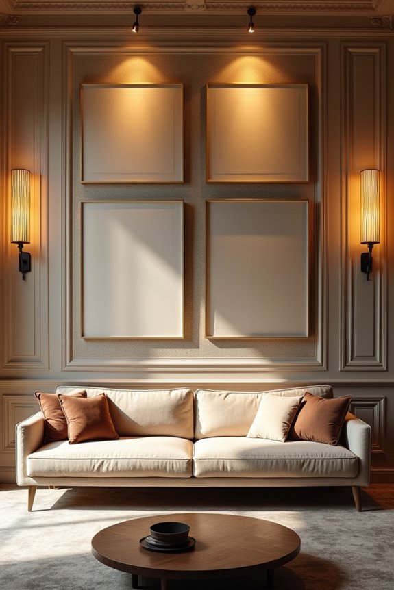
Why does lighting feel like the magic trick nobody tells you about?
I’d hung my console art like a trophy, stepped back—and watched it disappear into shadow. Enter: the picture light. Suddenly, my gallery wall didn’t look like I’d forgotten to dust it. A dedicated picture light brings overlooked artwork into focus, highlighting details that vanish without it. Wall sconces flanking your focal point? They’re the design equivalent of finally understanding why my mom always said “good lighting changes everything.” It does. It truly does.
Position these lights to avoid glare—nobody wants their prize piece looking like a ketchup-stained Chuck E. Cheese cup under fluorescent interrogation. Even distribution wins. This isn’t fussy; it’s intentional. Your wall deserves that museum-quality glow we’re all secretly chasing.
Ground It All With Strategic Furniture Placement
Because here’s what nobody warns you about: that gallery wall you’ve just perfected will feel completely untethered if your furniture’s still hugging the perimeter like it’s afraid of commitment.
I learned this the hard way—my beautifully curated art hung above an empty void while my sofa pressed against the opposite wall like a nervous wallflower. Strategic furniture placement changes that disconnect entirely:
- Pull seating away from walls to create genuine breathing room and depth
- Angle your arrangement toward the primary focal point—whether that’s your art or TV
- Frame everything with end tables and lamps for vertical scale
This approach grounds your design. Suddenly, your room feels organized rather than like you’re staging a furniture store display. Your wall becomes the anchor point, not just decoration floating in limbo.
Avoid These Large-Wall Decorating Mistakes
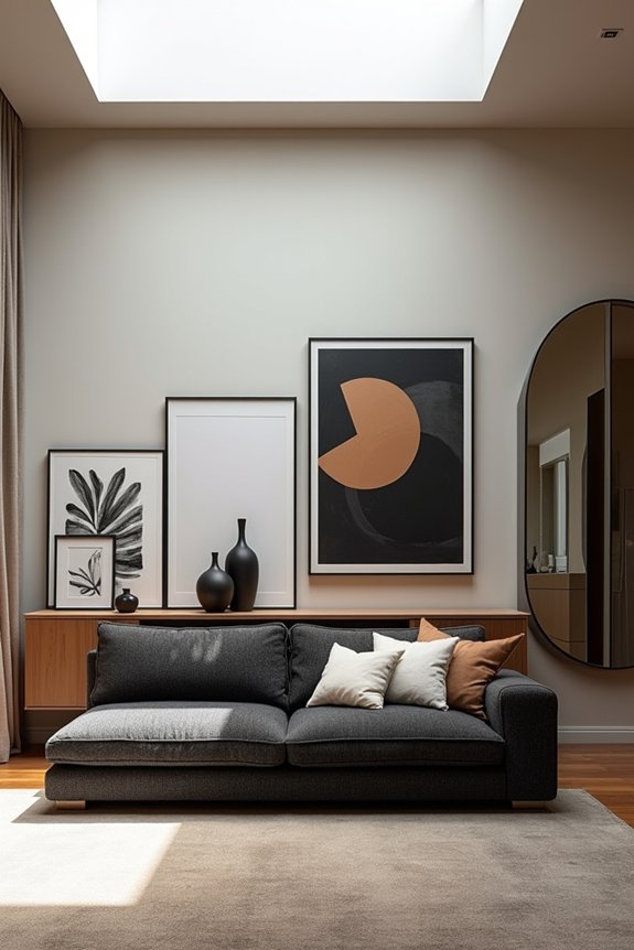
Now that you’ve got your furniture anchoring the room like it actually belongs there, let me save you from the mistakes that’ll undo all that good work. I’ve watched people—okay, *been* that person—plaster a large wall with seventeen tiny frames like they’re creating a gallery nobody asked for. Visual chaos ensues. Scale matters desperately. Those dinky floating shelves? They’ll make your room feel awkward and undersized. Ignore sightlines from your couch, and you’re basically decorating for ghosts. Test arrangements first—seriously, mock it on the floor before drilling holes you’ll regret forever. Finally, skip proper lighting, and your carefully chosen art drowns in shadow. These missteps turn potential focal points into expensive afterthoughts.